Anyone who has attempted to maintain a UI Style Guide over a long period of time will attest that it is a very difficult process. They are generally prioritised below the maintenance of your applications themselves and as such are likely the first candidates to fall behind and the last to be brought out of tech debt.
This is bad because once your Style Guide falls out of sync with your application(s) it has entirely lost its purpose. It is no longer a trustworthy representation of the state of your UI and will quickly fall out of favour with the design and development team.
This is bad because Style Guides are more than a nicety for developers to show off their style. Done properly, they can be a collaboration tool bridging design and development teams as well as a tool to break down the user interface into its component parts rather than than thinking about it as a whole or as a series of pages. They also serve as a resource for new designers and developers to locate existing patterns for further use.
These benefits should be sought regardless of the size or scope of your project but in order to achieve them they can't come at a cost to delivering features. If they do, they will inevitably be neglected.
Achieving this is a cultural challenge as well as a technological one. At Lonely Planet we managed to accomplish this by making the Style Guide an integral part of our development workflow.
This didn't happen easily though, before we found success with our latest attempt we had tried and failed with two earlier approaches and unearthed problems that helped us mould our final solution.
The problem with current Style Guide Solutions
A Static HTML Style Guide
Style Guides built with static HTML are standalone representations of your UI components with no direct link to your codebase. Once you change or refactor your HTML or CSS you need to update the Style Guide if you want it to reflect the latest version.
The main difficulty with keeping this up to date with your application is having to update both versions of the same template. It requires diligence on the part of all developers to manually keep it up to date.
I built a static html Style Guide a couple of years ago to try to decipher the UI we had inherited. It gave me some clarity on our UI but didn't fit into our workflow and ultimately didn't make our work any easier. It quickly became a burden to maintain and fell behind and out of importance.
It's worth mentioning that as a design tool, or as a deliverable to a client who is going to carry on the development, static Style Guides are a fantastic starting point.
A Living Style Guide
Living Style Guides should be the answer to these problems. They autogenerate Style Guides when changes are made to the codebase so in theory they shouldn't be able to fall behind. There are a whole host to choose from and many can be set up with fairly minimal effort.
Back in 2012 we implemented KSS: a fairly popular tool for generating living Style Guides developed by Kyle Neath and used at Github. Unfortunately, it only lasted 2-3 months before it was clear it had diverged from the components within our application.
So, given it's “living”, why did it fall behind?
The majority of living Style Guide generators work by analysing the CSS: parsing comments within the files to create the documentation and to know which components to render. It makes sense that they would take this approach because CSS is easily analysed and consistent across projects. For a generic library to work across multiple applications it requires a constant to work from but it's this key design decision which ultimately makes them hard to maintain.
There are a couple of significant ways in which we believe this type of Style Guide is unmaintainable:
1. Duplication of templates
The majority of living Style Guide solutions follow a pattern something like this:
  /* Style Guide [Buttons]
    <button class="btn-primary">Button</button>
    <button class="btn-secondary">Button</button>
  */

  .btn-primary {
    color: blue;
  }

  .btn-secondary {
    color: red;
  }
How should Style Guides work?
They should focus on the templates. Crucially, if you're rendering templates to a Style Guide and you want it to be maintainable then they can't just be identical to your application templates, they need to be the exact same templates. This is easier said than done. Templates within an application can be written in many different languages and are generally coupled to a data layer, embedded deep into an application and hard to get to. This makes it very hard for a single Open Source tool to parse your templates. It would have to work across a multitude of technologies and disparate application architectures. It's therefore unsurprising that most Style Guide generators use some form of static analysis to render components. This doesn't mean it's impossible to achieve. It does require your application to be built at a component level in order for the Style Guide to reach the same components without understanding your entire application. This can involve a decent chunk of work although the process of restructuring your application into a component based architecture can be the mechanism to simplify and normalise the UI: bringing benefits far beyond the Style Guide itself. This is the process we have taken at Lonely Planet, creating a component layer which both our user-facing applications and our Style Guide can work from.Building a Component API
Slides from "Reducing Complexity with a Component API"
I go into more detail on the reasoning behind this process in my Front End Ops talk. The process of decoupling the User Interface from the application, and splitting them into components, had a lot of positive effects on our workflow and codebase. The goals and benefits of a Style Guide were exactly what we wanted but, not knowing how to achieve them, we started by extracting as much of our UI into components and moving them outside of the applications. This also gave us the opportunity to normalise and condense our UI. Once done, we created a very simple API in which to fetch them from the Component Layer. Having the api for us was crucial because we wanted to maintain the mapping between the latest version of the the component and the application, and not have developers copy and paste component code. Having a single version of the component, accessible via an API, worked perfectly with unit testing too so we could ensure that the contract between the API parameters and the returned template was solid. We could modify and extend the component based on the data we passed it and assert on the returned result. This also allowed us to add accessibility helpers and microformat attributes as standard and ensure that they weren't forgotten when used in new applications.A typical API call:
  // Input
  = ui_component("forms/search", {label: "Search"})

  // Output
  <form class="search--primary" action="//www.lonelyplanet.com/search">
    <label class="accessibility" for="search-q">Search</label>
    <input class="search__input" id="search-q" name="q" tabindex="1" type="search" value="" />
    <button class="search__button" id="search-q-submit" name="search-q-submit" type="submit">Search</button>
  </form>
The developer can modify and extend the component by manipulating the input data. For example, if we wanted to add autocomplete functionality to this search form we would usually do so by adding classes and maybe initialise a JS component somewhere. Within the scope of the Component API we can simply pass in a new boolean and it will add what is necessary:
  // Input
  = ui_component("forms/search", {
    label: "Search",
    autocomplete: true
  })

  // Output
  <form class="search--primary js-autocomplete" action="//www.lonelyplanet.com/search">
    <label class="accessibility" for="search-q">Search</label>
    <input class="js-autocomplete-input search__input" id="search-q" name="q" tabindex="1" type="search" value="" />
    <button class="search__button" id="search-q-submit" name="search-q-submit" type="submit">Search</button>
    <div class="js-autocomplete-container"></div>
  </form>
Style Guide Driven Development
Once the API is being used to fetch components, all that we really have inside any application are data representations of the components. It's therefore pretty simple to scaffold a quick application that requests every component, multiple times, with differing data. This becomes our Style Guide. Where a regular application might request a handful of components, the Style Guide requests every component, again and again.
It's always up to date with the rest of lonelyplanet.com because it uses the exact same templates and CSS. As we're not just doing static analysis of the CSS we are also able to showcase components that require JS too. It becomes a risk free environment where developers can build and tweak components and then allow them to propagate out to the rest of the applications.
In fact, it has become the primary arena for development. Once you have this concept of a component layer it is irrelevant to a developer where they render it for testing. What we have seen is an organic move towards Style Guide Driven Development where developers are using it to build and iterate on components long before they reach any application. This is not something we expected but is certainly a validation of the approach and a polar opposite to our previous attempts where the Style Guide was seen as a blocker to quick feature development.
How it all works
One thing I really didn't cover in my talk was the implementation side of Rizzo and I've had a lot of questions around it since.
We have two different buckets of apps that integrate with Rizzo at LP: Rails Apps and All Other Apps.
Rails Apps
Rizzo is included as a Gem within all our applications and acts as an engine, thus exposing its partials and assets to the host App. The implementation of the API here is extremely simple and is really just sugar coating around a partial call. The only part that makes this different to just calling a partial is that it lives outside of, and is shareable across, all applications. These helpers act as the API for the Style Guide and the applications.
  -# Called from an application
  def ui_component(type, properties)
    render "components/#{type}", properties
  end

  -# Called from the Style Guide
  def styleguide_component(type, properties)
    ui_component "components/#{type}", properties
    render "styleguide/description", type, properties
  end
There is a little bit more to it but that covers most of how it works. Very, very simple. It's much more a methodology change than it is a technical challenge.
Other Apps
Non-ruby apps don't have the luxury of including Rizzo as a Gem (though we may look into using it with other package managers). For now, we host Rizzo as a service and expose http endpoints to return the templates. For example, hitting http://rizzo.lonelyplanet.com/global-body-header will return the html for part of our header.
This adds an extra layer of complexity for these applications as they then have to implement a caching layer for Rizzo components. We cache these templates when the application boots. It's not perfect but given our primary stack is Rails it's not something we have spent too much time on yet.
The Style Guide
Once you have a component architecture your Style Guide can simply be another application. Ours is a tiny Ruby app, but you could use absolutely any technology including a simple static site generator.
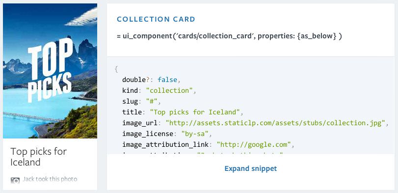
The Style Guide simply loads up some data for a particular type of component and then iterates through it: rendering the component and the component description each time. Note it's calling styleguidecomponent which ultimately calls uicomponent the same as any other application would.
-# Load the data
- cards = YAML.load(File.read(File.expand_path('data/styleguide/cards_stubs.yml', __FILE__)))

<h1>Cards</h1>

-# Iterate through the data collection and render the components
- cards.each do |card|
  = styleguide_component("cards/#{card[:title]}", properties: card)
With this approach we only have to modify the underlying data to add more components or modify existing ones.
Assets
A common question has been how do we handle CSS and JS related to these components. Unfortunately I don't have a clever answer for this at the moment, it's a mostly manual process.
We split both our CSS and JS out into common and application files. Inside the common.css|js we load the base code as well as our most often used components (stored in /components/core). This is then cached across the entire suite of applications.
To use any non-core components within an application the developer would need to import the component's related assets using Sass and requireJS.
I think there is definitely room to improve this process using tools like Component or AssetGraph and it's something we'll be looking into soon. For the moment, it is reasonably trivial to handle manually.
Rizzo
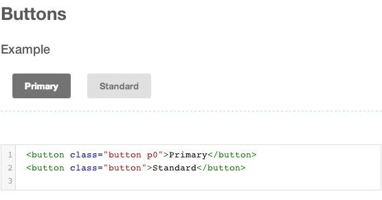
Our Style Guide is named Rizzo and is available at rizzo.lonelyplanet.com. The source code is also now public at github.com/lonelyplanet/rizzo. The implementation is very bespoke to Lonely Planet but should give some indication of how it works if you are interested in taking a similar approach. Here are a few example pieces that make up Rizzo:
Conclusion
I believe that the difference between Rizzo and our previous two Style Guides, in terms of their successfulness, is that with Rizzo we didn't focus on the Style Guide as the deliverable. Instead we focused on reducing complexity and increasing reusability. The Style Guide was then simple to add on at the end but, had it not been, we would still have been in a better place regardless.
To achieve something like this you're never going to be able to just run a grunt task and have it happen for you. Unfortunately it's not something you can add on at the end, though nor should it be. It requires you to contemplate your site architecture and structure as the main focus and the benefits of that can then extend far beyond a Style Guide.
At Lonely Planet we have a long way to go to create a solid, consistent platform, but this has certainly been proven as a step in the right direction. If you are starting a new project, or you have the means to invest some time in maintainability, I would thoroughly recommend a component based architecture along these lines.